MakeMyTrip
2024
Increasing Adoption for My Wallet in Flight Funnels
In Summer 2023, I interned as a User Experience Designer at MakeMyTrip (MMT), India’s largest online travel platform. With a user base of over 54.92 million users, MMT provides end-to-end travel services including flights, hotels, cabs, and local experiences. Operating at this scale requires efficient systems, especially in the post-booking experience where customer trust is tested so small frictions in post-booking flows (cancellation/refunds) can quickly turn into trust issues, support volume, and business cost.

Overview
Context
MakeMyTrip introduced “Refund to My Wallet” to reduce PSP (Third party payment) fees and keep users in the flights ecosystem but still the user adoption stayed low and company had to pay the cost.
Here I stepped in as a solo designer and redesigned the decision screen using discoverability, scannability, and persuasion design principles to increase wallet selection and reduce refund-timeline queries.
Problem
User Reduction on my wallet button selection by 86% in 6 months
MakeMyTrip introduced “Refund to My Wallet” on the refund selection screen to
Reduce PSP (third-party payment provider) fees
Keep users inside the MMT flight ecosystem so they could rebook faster and increase repeat usage.
However, after launch, adoption stayed low. Users continued selecting Refund to Original Payment Method. That had a compounding impact on other places as well:
Refund-related query calls increased
PSP fees rose because fewer refunds stayed inside the wallet system
Users became impatient waiting for refunds resulted in user's satisfaction dropped
Brand trust declined ,rebooking/retention opportunities were lost.
Why This Problem Matters ?
Refund processes are a key post-booking touchpoint where user trust is either reinforced or eroded. When users face confusion or delay during refunds, it not only affects their experience but also leads to avoidable business costs.
Retaining refunds in the MMT wallet ensures users remain within the MMT ecosystem, encouraging faster rebooking.
Reducing third-party payment reversals saves on processing fees
Goal
How might we redesign the refund experience so that users feel confident choosing the "My wallet" option which can lead to faster refunds for users & increased retention for the business ?
Solution
Driving user retention through behavioural UX
I redesigned the refund decision-making screen after the key insights from the quick research (Cognitive Walkthrough and Operational team interviews) I did on my end with current users that this was more than a UI issue, it was more of a behavioural decision making problem.
So I approached the solution by focusing on information clarity, visual distinction, and persuasive design

Redesigned UI for Refund Screen
Research
Product Discovery
This was a quick project with high urgency, so I prioritized research that directly informs design instead of long discovery. Two areas that I focused on were:
User Behavior around "My wallet" button
The focus was to identify why users ignored the my wallet refund option despite its benefits.
Identifying the core of the problem space
This was to determine if the problem we are solving is a UI issue, a trust issue, or a more systemic design flaw.
My Approach was a lightweight study, I quickly validated the issue through
Understanding Behavior signals - so if the adoption is low then users are defaulting selecting to original payment mode option rather than "My Wallet Option"
Operations teams insights through interview highlighted the patterns in refund-related calls and user complaints about refund getting delayed.
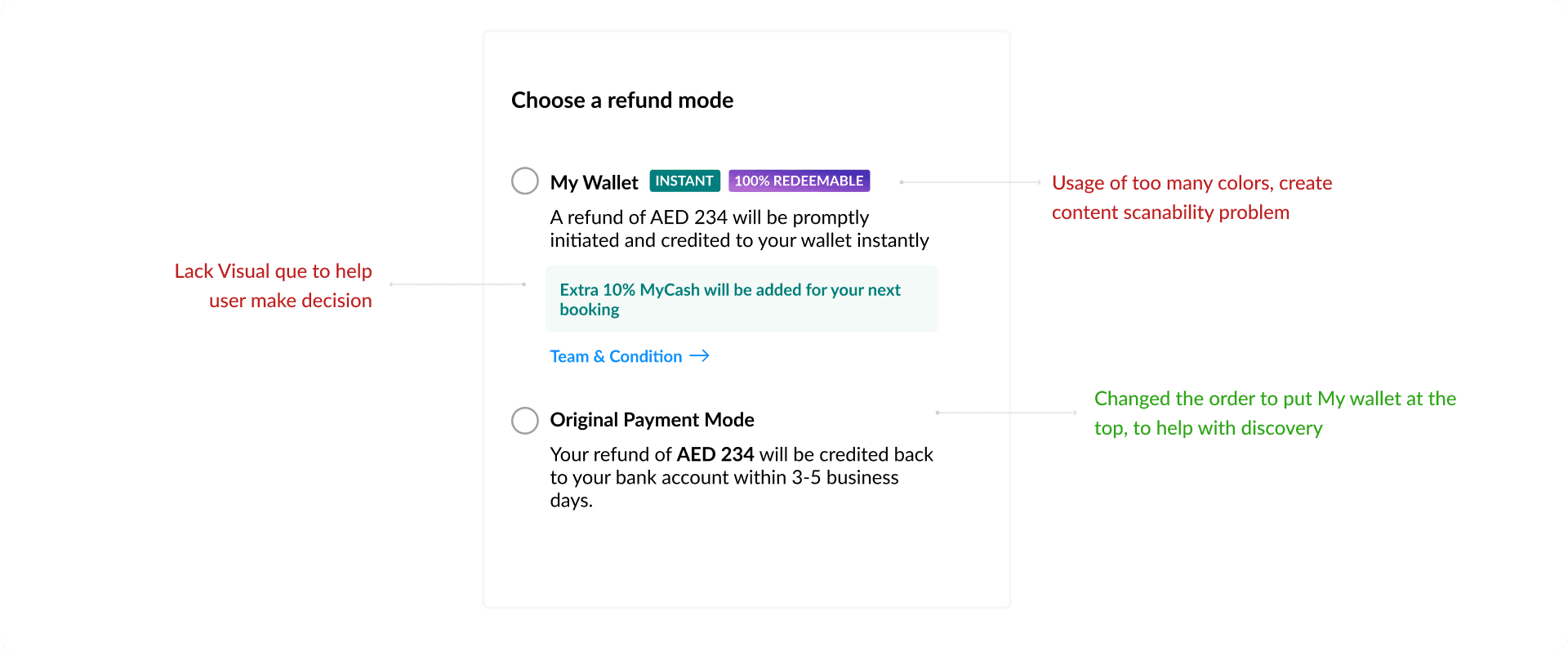
UX audit of the existing screen highlighted content hierarchy, accessibility/scanning, persuasion gaps.

Old UI for the refund screen
Design Ideation
User flow and Iterations
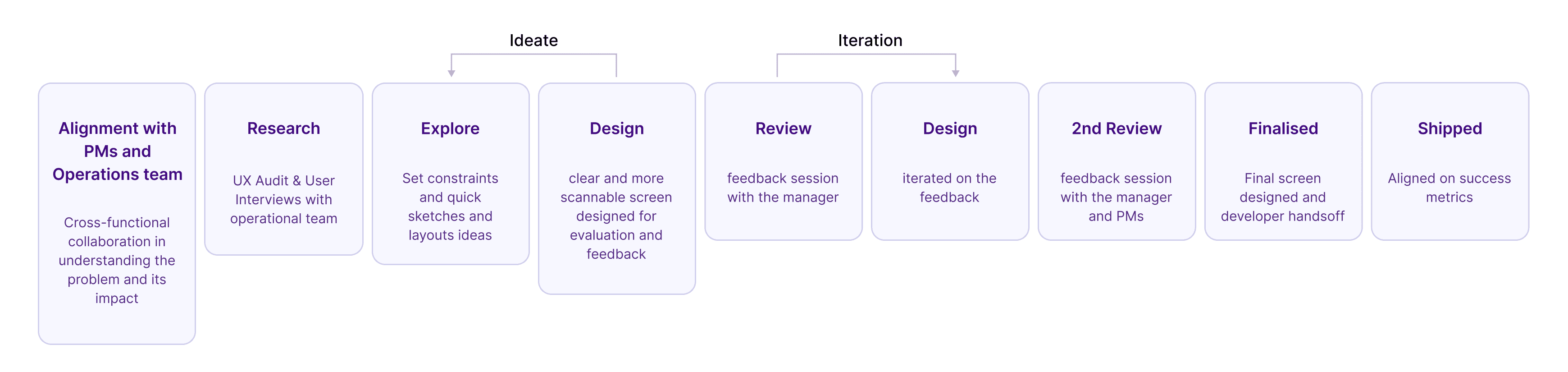
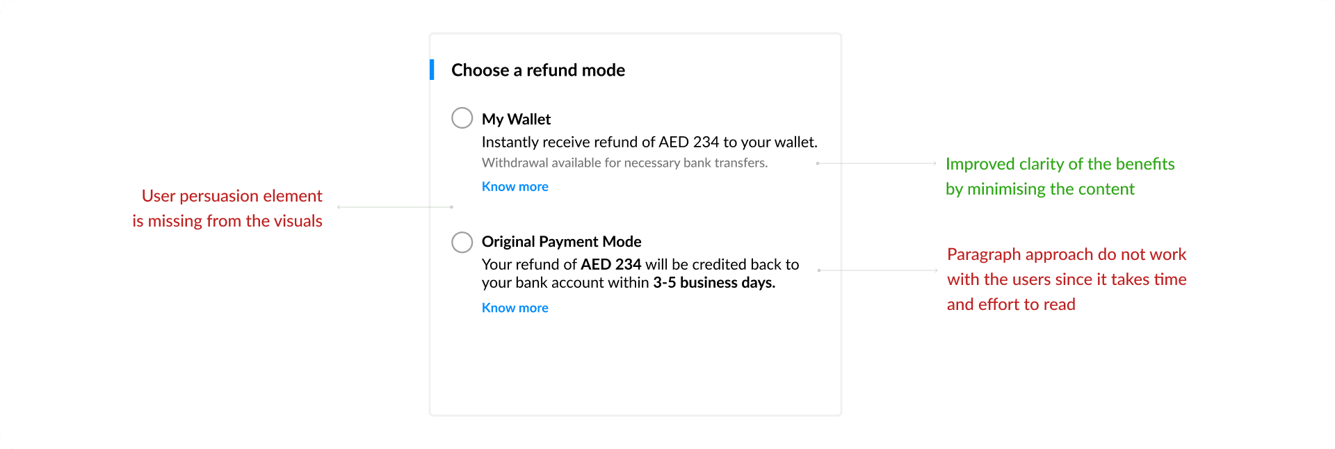
Design process for this project was tight looped quick decision making followed by iterative designing. The designs went through stakeholder reviews , the process was collaborative and I sorted the feedback early.
Impact
Final Design focused on Discoverability, User Persuasion and Clarity of content
This project highlighted the difference between designing for individuals and designing for organizations. While expense tracking focuses on visibility, financial operations depend on coordination between people, teams, and processes.
The most impactful improvements came from making responsibilities, approval states, and next steps visible throughout the workflow. By reducing ambiguity and creating clearer pathways through the system, the experience became easier to navigate while supporting significantly more complex organizational needs.
This feels much closer to the style and depth of your Polaris case study while still being noticeably shorter.

Reflection
What I learned from this project ?
Validate every problem, no matter who defines it: I learned to question the brief and back decisions with real user insights. Instead of relying solely on the PM’s framing, I validated the drop in wallet refunds through qualitative and quantitative methods.
Behavioral design is powerful when applied with intention: Defaults, layout hierarchy, and copy all influence user decisions. Nudging done right can align user needs with business goals ethically.
Microcopy is not an afterthought—it's strategic: By rewriting how refund options were explained, we helped users understand and trust the wallet option.
Working cross-functionally improves results: Collaborating with PMs and developers helped me balance ideal UX with engineering feasibility. I also practiced presenting to non-design stakeholders and defending design choices using data and user insights.
